
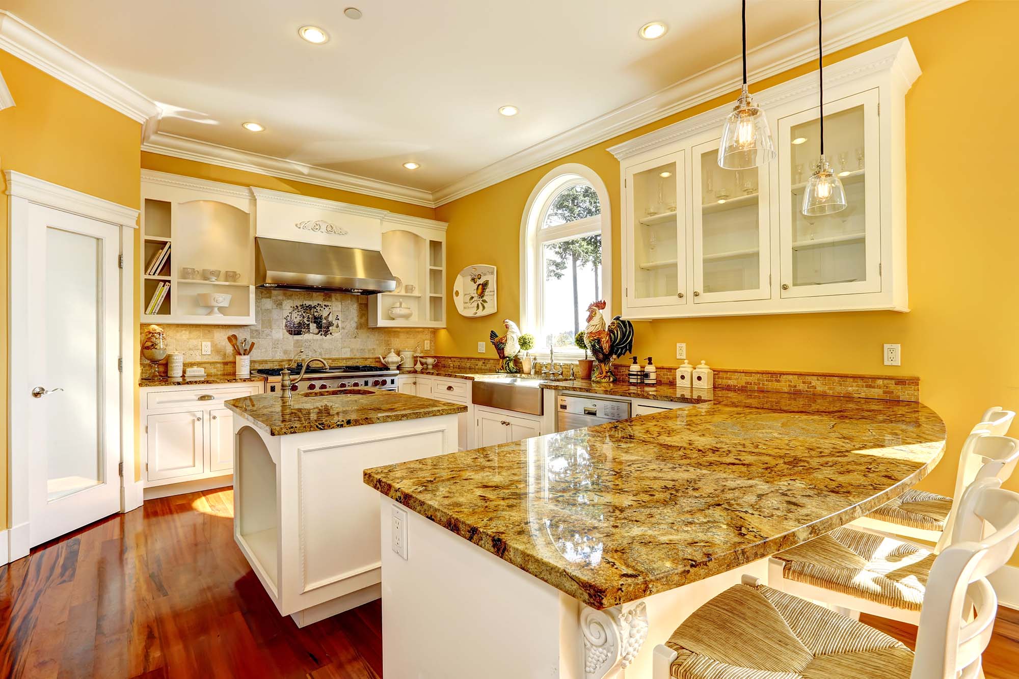
Most people pick cabinet color the same way they'd pick paint, by holding up a sample and deciding if they like it. That approach works fine in a lot of the country. It falls apart in New Mexico, where UV intensity is some of the highest in the continental United States and south facing windows can wash out a color by early afternoon. Choosing cabinet color here means thinking about light the way you'd think about it for photography, not just decor.
Why Desert Light Changes How Cabinet Color Reads
Direct high desert sun carries more blue and UV content than the filtered light in humid climates, and it hits surfaces at a sharper angle for more hours of the day. A cabinet finish that looks warm and grounded in a showroom under standard lighting can look flat or slightly gray once it's sitting under a wall of west facing windows in Rio Rancho. This is especially true for whites, which can swing between looking crisp and looking sterile depending on how much daylight bounces off nearby stone, tile, or stucco.
The fix isn't avoiding light colored cabinets, it's testing them under your actual conditions before committing. A finish sample taped to your cabinet wall for a full day, checked at 9am, 1pm, and 5pm, tells you far more than a photo or a store display ever will. Rooms with a lot of exterior light exposure also tend to show wood grain and brush texture more clearly, which is worth factoring in if you want a smoother, more uniform look.
Warm Neutrals That Work With Intense Sun
Warm neutrals with a slight earth undertone tend to hold up best against strong southwestern light. Think soft clay, warm taupe, and muted terracotta leaning tones rather than pure beige. These colors work with the natural warmth of the light instead of fighting it, so they read as intentional rather than washed out during peak sun hours.
These tones also pair naturally with the stone, tile, and stucco palettes common throughout Albuquerque, Rio Rancho, and Santa Fe homes, which means less risk of a kitchen looking disconnected from the rest of the house. A warm neutral cabinet also tends to photograph and resell well, since it reads as updated without locking a kitchen into a narrow style.
Cooler Tones and When They Still Make Sense
Cooler cabinet tones, like soft sage, slate blue, or a true charcoal, aren't off the table in New Mexico, but they need the right supporting cast. These colors do best in kitchens with north facing light, partial shade from a courtyard wall, or window treatments that soften direct sun. Without that buffer, a cool tone can look almost gray by midafternoon and lose the depth that made it appealing in the first place.
If a cooler tone is the direction you want, pairing it with warm toned hardware, like brushed brass or warm bronze, helps balance the temperature of the room and keeps the space from feeling cold under bright daylight. Layering in a warm wood accent, such as an island in a different finish, does the same job.
Two Tone Approaches for Balancing Light and Shadow
Two tone kitchens work particularly well in high desert homes because they let you place a cooler or bolder color where the light is more controlled, like on a lower cabinet run away from direct sun, while keeping a warmer neutral up top where light exposure is strongest. This isn't just a style trend, it's a practical way to manage how a single finish can look completely different depending on where it sits in the room.
A common approach here is warm wood tone or cream uppers paired with a deeper, cooler lower cabinet run. This keeps the upper cabinets from looking blown out under strong overhead light while still giving the room contrast and visual interest at eye level.
Choosing Undertones That Age Well
The most timeless cabinet colors in this climate share one trait, a stable undertone that doesn't shift dramatically between LED task lighting at night and full sun during the day. Testing a sample under both conditions before ordering avoids the common surprise of a color that looked perfect in the evening and completely different by 2pm.
Undertone stability matters more than trend forecasting here. A color with a clean, consistent undertone will still look intentional in ten years, while a trendy but unstable tone can start to look dated or mismatched much sooner, especially once New Mexico's sun starts working on it every single day.
Choosing the right cabinet color for a New Mexico kitchen is easier with an in person look at how light moves through your specific space.
Clay Design & Material Gallery works with homeowners throughout Albuquerque, Rio Rancho, Santa Fe, Taos, Farmington, and Los Lunas, NM to test finishes against real conditions before anything is ordered. Visit Rio Rancho, NM to see cabinet colors and undertones in person, browse our cabinet options, and contact us to schedule a design consultation.