
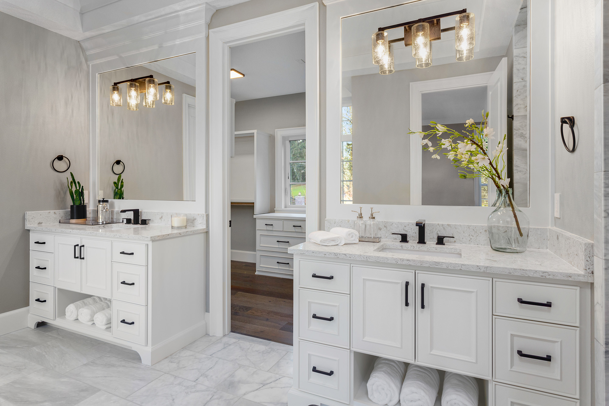
“Make it brighter” is the most common lighting request, and the most common regret. Because brightness is only the volume knob. Color rendering is the fidelity. If you’ve ever installed “super bright” LEDs and your cabinets suddenly look gray-green, your floors look plastic, or people look tired, you’ve met the difference.
At Clay Design & Material Gallery, we help homeowners and commercial clients choose LED lighting that looks correct on the stuff you actually have: wood tones, stone, paint, food, fabric, and skin.
Step 1: Don’t confuse these three specs
Lumens: how much light output (quantity)
CCT (Kelvin): how warm or cool the light appears (tone)
Color rendering: how accurately colors appear under that light (quality)
A 4000K 2000-lumen fixture can still make a space look “off” if rendering is weak or skewed.
CRI: useful, but it can be gamed
CRI (Color Rendering Index) rates how accurately a light source renders colors compared to a reference source at the same CCT. Most marketing focuses on 80 CRI or 90+ CRI.
Here’s the hot take: CRI is a blunt instrument.
CRI averages performance across a limited set of color samples (historically R1–R8).
Many manufacturers quote CRI without emphasizing the critical red sample (R9).
Two “90 CRI” products can look wildly different in a kitchen.
What to ask for (technical):
CRI (Ra) AND R9 value.
In spaces with wood, food, or skin tones (kitchens, restaurants, retail), a higher R9 usually matters.
Consistency metrics (if available): MacAdam steps or binning (helps prevent “patchy whites” across fixtures).
TM-30: the modern, more diagnostic metric
TM-30 is a newer evaluation method developed to better represent real-world color rendering. It commonly reports:
Rf (Fidelity Index): how accurate colors are overall (like a more robust CRI)
Rg (Gamut Index): whether colors are pushed more saturated (>100) or muted (<100)
Why this matters: two LEDs can have similar “accuracy,” but one makes colors feel slightly boosted (lively retail) while another makes them feel flat (some offices hate this, some museums love accuracy).
Practical interpretation:
High Rf = truer color appearance
Rg around 100 = neutral saturation
Rg > 100 = slightly more vivid (can be great for merchandising, risky for skin tones)
Rg < 100 = muted (can feel dull, but sometimes reduces visual noise)
Real-world spaces: what specs actually fit
Kitchens (residential):
Goal: natural food color + flattering skin tones + true cabinet finishes
Look for: higher fidelity, strong reds, and stable binning across fixtures
Restaurants & hospitality:
Goal: food looks appetizing, faces look healthy, ambiance stays consistent from day to night
Consider warm-dim or dimming that doesn’t break color quality
Retail:
Goal: fabrics, paint, product packaging look “right” and consistent across aisles
TM-30 becomes more useful here because saturation control (Rg) can influence perceived “pop”
Offices:
Goal: comfort + reduced strain + stable white appearance
Avoid harsh glare and inconsistent CCT; rendering still matters for skin tones on video calls
The hidden culprit: cheap drivers and poor dimming
Even high-quality LEDs can look bad if the driver is mismatched:
Flicker can create fatigue, headaches, and camera banding
Poor dimming compatibility can cause stepping, dropouts, buzzing, or color shift
Some LEDs shift green/pink as they dim if components are low-grade
So: color rendering is not a single-number win. It’s fixture + driver + dimmer + application.
Quick spec checklist you can actually use
When comparing LED fixtures or lamps, ask for:
CCT: 2700K / 3000K / 3500K (match the space)
CRI (Ra): don’t settle for “bright” alone
R9: especially in kitchens, hospitality, retail
TM-30 (Rf/Rg): if available, use it to compare “feel” between products
Binning / MacAdam steps: to avoid mismatched whites
Driver + dimming type: 0–10V, TRIAC, ELV, and tested compatibility
If your lighting makes everything look “wrong,” the fix isn’t always more lumens. It’s choosing sources that render materials and people accurately, and pairing them with compatible drivers and dimming.
At Clay Design & Material Gallery, we can help you select LED options that match your finishes, use-case, and controls so your space looks intentional, not accidentally fluorescent. We serve clients across Albuquerque, Rio Rancho, Santa Fe, Taos, Farmington, and Los Lunas, NM. Contact us or visit us at Rio Rancho, NM to compare fixtures side-by-side and get spec guidance for your home or commercial project.